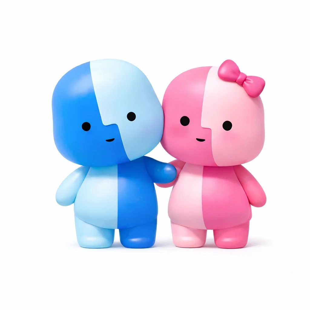
It's saddening to me how the all the Mac OS X icons have slowly lost their definition and uniqueness over the years - this twee figurine is just the cherry on the excrement sundae. It doesn't even have the smile crossing both sides.
At least they remembered where the dark and light colors go this time around[1].
[1]: https://512pixels.net/2025/06/wwdc25-macos-tahoe-breaks-deca...
- [deleted]
I can understand your general point, but how can you argue that this in particular isn't unique/cute whatever?
> but how can you argue that this in particular isn't unique/cute whatever?
The perceived cuteness was partially what I was complaining about. It's just a bad approximation of the finder icon on a generic "chibi" body.